

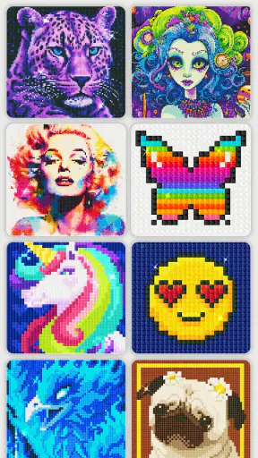
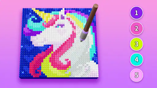
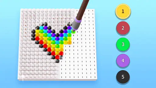
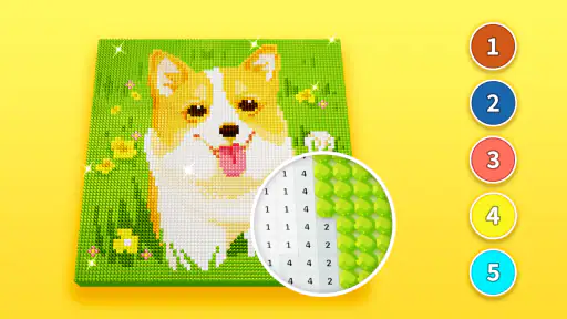
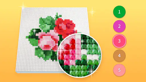
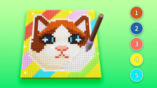
I found Diamond Painting by Number to be a calm, low-pressure art app that makes a traditionally fiddly hobby approachable on a phone. Instead of asking me to draw from scratch, it turns an image into a numbered mosaic and lets me fill the matching sections with colored “diamonds.” That simple idea is the reason it works so well for beginners: I can concentrate on choosing the right symbol and placing pieces rather than worrying about artistic skill.
It is published by Creative APPS and sits in the Art & Design category. The app is free to start, carries an Everyone age rating, and has built a 4.5 average from around 17 thousand ratings. Its audience is clearly broad, but the most interesting question is not whether the app is easy in a general sense. It is whether the interface, pace, and visual demands suit different abilities and everyday situations. In my experience, it does many things gently, while still leaving a few practical barriers for people who need stronger customization.
How readable and understandable the workspace feels
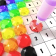
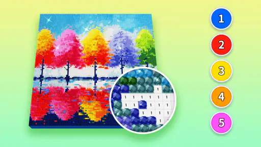
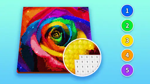
The first thing I noticed was how quickly the main activity becomes understandable. A picture is divided into small areas, each associated with a number or color, and the task is to select the matching option before filling the spaces. That creates a clear visual loop: find a target, choose its color, complete it, and move on. I never felt that I needed drawing knowledge to begin, which is a major advantage over sketching apps that present a blank canvas and a large collection of tools.
The numbered structure also helps reduce decision fatigue. In a conventional coloring app, I have to decide which brush, shade, opacity, or layer to use. Here, the image itself provides most of the direction. For a new user, that makes the screen less intimidating. The short description, “Diamond Painting,” is brief, but the actual concept is easier to understand once the first image is open.
Navigation is most comfortable when I treat the app as a focused activity rather than a full creative studio. I can browse for a design, open it, and work through the numbered areas without learning a complicated editing system. That simplicity should help people who dislike crowded interfaces or who find multi-tool art programs overwhelming. It also makes the app suitable for a child or an older relative who wants a guided pastime rather than a lesson in digital illustration.
There is a useful distinction between visual simplicity and perfect readability, though. A clean screen does not automatically make every tiny section easy to see. Diamond painting depends on small details, so the experience can become more demanding as the image gets denser. I found that the app is clearest when I work on a larger phone screen, keep the display comfortably bright, and avoid rushing through areas with similar-looking symbols.
For someone with color-vision differences, the numbers are particularly important because they offer information beyond color alone. I would rely on the symbol or number rather than trying to distinguish close shades by sight. That is one of the app’s strongest inclusive qualities: the basic task is not presented as a pure color-matching exercise. Still, the overall artwork remains visually rich, so users who cannot comfortably inspect small symbols may need a larger display or may find the format tiring.
I also appreciate that the activity has a predictable rhythm. Once I understand the relationship between a number and its matching diamond, each new section follows the same logic. Predictability can make an app easier to revisit, especially for people who prefer familiar routines. The trade-off is that users looking for spontaneous experimentation may find the structure restrictive. This is guided decoration, not an open-ended drawing tool.
What the guided format does better than ordinary coloring apps
Compared with a typical digital coloring book, this app gives me more of a completion process. I am not simply dragging a finger over large flat regions; I am gradually revealing a detailed picture through many small choices. That can make the finished result feel more earned. It also gives beginners a clear answer to the common question, “Where do I start?” I start with the indicated number instead of inventing a method.
Compared with a professional drawing app, the benefit is even more obvious. There are fewer controls to remember, fewer ways to accidentally spoil an image, and no expectation that I know how to use layers or brushes. The cost of that simplicity is creative control. I cannot approach the activity like a painter, change the composition freely, or use it to develop drawing technique. People who want to create original illustrations would be better served by a sketching application.
Motor comfort, sensory load, and the pace of placing diamonds
The central physical action is repetitive tapping or touching small areas. That makes the app approachable for someone who has difficulty with drawing gestures, because it does not demand long, precise strokes. A short tap can feel easier than controlling a brush across a screen. It is also less intimidating for a beginner who worries about shaky lines or accidental marks.
At the same time, repetitive tapping is not effortless for everyone. A person with hand pain, tremors, limited range of motion, or fatigue may find dense pictures demanding even if the rest of the interface feels simple. The app’s guided design reduces the complexity of each action, but it does not remove the need for repeated accurate touches. I would recommend short sessions rather than treating a large picture as something to finish in one sitting.
A practical technique is to work in small visual zones instead of chasing every instance of a number across the entire image. This keeps my hand movement more local and makes it easier to remember where I am. It also reduces the mental strain of repeatedly scanning the whole picture. When symbols are close together, I slow down and check the target before tapping; speed is less useful than avoiding a chain of misplaced touches.
People who use a stylus may find the small targets easier to approach, although the app is still fundamentally designed around touch. A stylus can improve control for some users, but it may not help someone who needs larger targets or has difficulty maintaining pressure. I would not assume that an accessory solves every motor challenge. The best experience depends on whether the user finds light, repeated contact comfortable.
Sensory considerations matter too. The bright colors and detailed patterns are part of the appeal, but they can also make a busy image visually intense. I found calmer designs easier to use when I wanted to relax, while highly detailed artwork required more concentration. Someone sensitive to visual clutter may prefer choosing simpler pictures and working with the screen brightness adjusted to the room rather than leaving it at maximum.
The app’s slow reveal can be soothing for users who enjoy repetitive activities. It gives the hands something structured to do while the mind settles, and it does not create the pressure of a timer or competitive score-driven task in the way many games do. However, that same repetition will not suit someone who needs constant novelty. If tapping similar areas quickly becomes frustrating, a freehand drawing app or a coloring tool with broad fill areas may be a better match.
Using it with children and older family members
The Everyone rating makes the app a reasonable candidate for shared family use, but age suitability is not the same as independent usability. A child may understand the matching idea quickly yet still need help with small targets or with navigating to a preferred image. An older adult may enjoy the familiar craft-like concept, particularly if digital drawing feels too complicated, but a small phone can make the symbols tiring to inspect.
For a family session, I would begin by opening one simple picture and demonstrating one complete color group. That avoids a long explanation and lets the user learn by watching the result appear. I would also use a tablet-sized screen when possible. The larger surface does not change the app’s basic controls, but it gives the eyes and fingers more room to work, which can make the same activity feel much less demanding.
There is also a social use case here. Two people can compare completed pictures or take turns choosing which design to work on, even though the actual filling remains an individual task. That makes it a pleasant quiet activity during a visit or a relaxed evening. It is not a multiplayer game, so users expecting shared live interaction should choose something built for that purpose instead.
When and where the app is easiest to use
Diamond Painting by Number fits short breaks unusually well. I can open it while waiting for an appointment, during a quiet commute when it is safe to use a phone, or at home after finishing a more demanding task. A single small section gives me a natural stopping point, so I do not need to commit to a long creative session. That makes the app more practical than a physical diamond-painting kit, which usually requires materials, workspace, and protection from spills.
Its digital format also removes several ordinary craft obstacles. There are no loose beads to sort, no adhesive canvas to keep flat, and no need to clear a table before beginning. For someone living in a small space or sharing a home with children and pets, that convenience is meaningful. I can pick up the activity and put it away without leaving a physical project exposed.
The phone format has its own situational limits. Small screens are less comfortable for detailed artwork, and glare can make symbols harder to distinguish outdoors. In a dim room, a bright screen may be unpleasant; in strong daylight, a low brightness setting may reduce clarity. I would choose the device and environment deliberately rather than assuming the app is equally comfortable everywhere.
This is also a useful option for people who want a quiet alternative to scrolling. The task gives me a specific visual goal, so I am less likely to drift through unrelated content. It can work as a wind-down activity, although users who are sensitive to screen exposure before sleep may prefer a physical craft or audio-based pastime instead. The app is relaxing for many situations, but it remains a screen activity.
The free starting price makes experimenting easy, which matters when a user is unsure whether repetitive digital art will suit them. There are in-app purchases ranging from less than a dollar to around fifty dollars per item, so I would pay attention before confirming any optional purchase. The free entry point is helpful, but the presence of paid items means families should not treat “free” as meaning that every part of the experience is without cost.
The current version is 6.8.0, and the app runs on Android versions from 5.1 onward. That broad compatibility can help people using older devices, although actual comfort still depends on screen size, responsiveness, and battery condition. A phone that technically runs the app may not provide the clearest or smoothest experience for detailed work. I would judge it by how comfortably the user can inspect and tap the artwork, not only by whether installation is possible.
Where inclusion still meets practical barriers
The biggest remaining barrier is precision at a small scale. The app replaces freehand drawing with guided placement, but guided placement still asks the user to locate tiny areas accurately. Someone with low vision may struggle even when the numbered system is conceptually clear. Someone with motor limitations may understand exactly what to do but find the repeated taps physically exhausting.
Another limitation is that the experience is primarily visual. The image, symbols, and color relationships carry the meaning of the task. Users who need strong nonvisual guidance may not find enough support in this format. I would not choose it as a primary creative tool for someone who cannot comfortably perceive the workspace, because the core pleasure comes from watching the picture develop.
There is also a cognitive trade-off in the number system. For some users, matching numbers reduces confusion; for others, scanning symbols and remembering the selected color can become mentally tiring. Similar-looking marks are especially easy to mix up when I am distracted. Working with one color at a time, enlarging the view where possible, and taking regular pauses makes the process more manageable, but those habits cannot remove every difficulty.
Purchases are another point that deserves attention in a shared-device setting. The app is free to download, yet optional items can cost from $0.99 to $49.99 each. That range is wide enough that I would review purchase controls before handing the phone to a child or someone unfamiliar with mobile payments. The app remains accessible as a free starting point, but budgeting and supervision are part of using it responsibly.
Finally, the app should not be mistaken for a substitute for a physical therapeutic craft in every situation. A real kit provides tangible materials, a different kind of hand activity, and a finished object that can be displayed. This app wins on convenience and cleanliness, but it cannot reproduce the texture of actual diamonds or the satisfaction of handling a canvas. Choosing between them depends on whether the user values portability and low setup more than tactile feedback.
My inclusive verdict after using the app
I would recommend Diamond Painting by Number to beginners who want a guided art activity, people who enjoy repetitive visual tasks, and families looking for a quiet digital pastime. Its strongest inclusive feature is the way it lowers the artistic barrier: I do not need to draw well, understand professional tools, or prepare a physical workspace. The numbered structure gives the activity a clear entry point and makes it less intimidating than a blank canvas.
I would be more cautious about recommending it to anyone who has difficulty with small visual targets, repeated tapping, or visually busy screens. A larger device, sensible brightness, short sessions, and simple designs can improve the experience, but they cannot guarantee comfort. If the user needs extensive control over text size, target size, contrast, or nonvisual operation, a different art app with stronger customization may be the better choice.
Creative APPS has made something focused rather than feature-heavy, and that focus is both its appeal and its limit. I like it because the app gives me a peaceful task with an obvious sense of progress, not because it tries to replace a complete drawing studio. With over five million installs, it has clearly reached a substantial audience, and I can understand why: the concept is easy to grasp, free to try, and satisfying in brief sessions.
My final advice is to test it on the device you actually plan to use, begin with an uncomplicated picture, and stop as soon as your eyes or hand feel tired. If the symbols remain readable and the tapping rhythm feels comfortable, this is a friendly way to enter digital diamond painting. If those basic physical demands already feel frustrating, the app’s simplicity will not be enough to make it the right fit. For the right user, though, it turns a detailed craft into a portable, approachable routine.


